Reporting For Duty
It looks like you're new here. If you want to get involved, click one of these buttons!
Quick Links
Categories
How the official 007-logo evolved (what's your favourite?)

Used during the early Connery era:

Used during the last Bond film of Connery:


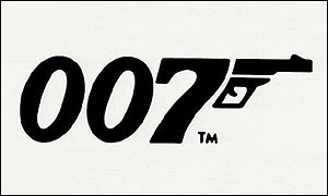
Used since AVTAK until the early promotional stages of 'GoldenEye':

Used during the first three Brosnan Bond's and QOS:

Used since DAD until SF.....QOS excluded:


And here the most recent tiny changes between the modern 007-logo that we know since 'GoldenEye'. Especially look at the length of the gunbarrel:


And here some other interpretations of the 007-logo that was different from Bond film to Bond film and was usually shown on the posters and main title designs:


Used during the last Bond film of Connery:
Used since AVTAK until the early promotional stages of 'GoldenEye':
Used during the first three Brosnan Bond's and QOS:
Used since DAD until SF.....QOS excluded:
And here the most recent tiny changes between the modern 007-logo that we know since 'GoldenEye'. Especially look at the length of the gunbarrel:
And here some other interpretations of the 007-logo that was different from Bond film to Bond film and was usually shown on the posters and main title designs:
^ Back to Top
The MI6 Community is unofficial and in no way associated or linked with EON Productions, MGM, Sony Pictures, Activision or Ian Fleming Publications. Any views expressed on this website are of the individual members and do not necessarily reflect those of the Community owners. Any video or images displayed in topics on MI6 Community are embedded by users from third party sites and as such MI6 Community and its owners take no responsibility for this material.
James Bond News • James Bond Articles • James Bond Magazine
Comments
Something quite charming about the hand-drawn versions of before but I can't help love the evolved and refined version from Casino Royale onwards, especially as they got rid of that little drop shadow...
Loving these 007 logos! :)
I would like to see some of the graphically talented people make their own version of the logo... just out of curiosity.
That could be fun!
But now I am reading the chapter about 'Dr. No' in the Taschen 007 Archives. And apparently the guy who designed the 007-logo only added a barrel to the '7'. Actually, the foot of the '7' TOGETHER with the 'added barrel/trigger' has to be seen as one gun! I thought that barrel+trigger was always one entire gun!
I never knew that! This completely changes the way I am looking at the 007-logo :-O!
Damn, I love the Taschen 007 Archives :-D.
You mean the '7' and the 'barrel' = the whole gun? Or only the little 'barrel with trigger' = solely a whole gun?
Now, I think I like OHMSS's logo best, then Skyfall's. Why I don't really know, they seem the most natural! Indeed, it would be great to see interpretations from members here who've got a graphic background!
Mind you, from a mere sleek, stylishly successful design perspective, the efforts that incorporated the logo vertically into CR and QOS's titles stand out for me. They're excellent. Always loved the similar, earlier incorporation of the logo into Sir Rog's above-the-title name on the LALD posters too...
i like the 007 logo but to set up a discussion on the minute changes boring sad etc
Watch the double posts @oorogers, though looking back, you have 3 very contradictory posts, are you sure you arent two separate users? One minute you say this thread is sad and the second your applauding it...then you go back on yourself again! I certainly know what side of you I disagree with!
My grandfather was the original 007 designer. If you have questions about it as me. He’s 96 and still going strong so
I can ask him your q’s.
Hi, and welcome! I'm interested to hear if there was other, unused «007»-designs that were made? And how did the process of creating the logo go – from start to finish?
(I'm a graphic designer myself, so any information would be a great read!)
Great work. I think in FRWL the logo changed with two bullets under the gun. Was he thinking in adding more bullets each film?
Yes the top left of the '7' is also like a folding stock.
Because it is important as what was the origin of the Mona Lisa smile. 007 is a cultural phenomenon like Michael Jackson, like Andy Warhol, like Armani, like Tom Ford like Ferrari. It is a brand. You name it.
Sincerely,
[email protected]
The 50th one was my favourite because it just screamed Bond