Reporting For Duty
It looks like you're new here. If you want to get involved, click one of these buttons!
Quick Links
Categories
In this Discussion
The Great Folio Slipcase Cover Poll.
To celebrate the publication of Octopussy and the Living Daylights, the final Ian Fleming James Bond Folio edition in the current series, I thought it'd be fun to put up a poll on people's preference for the slipcase cover artwork. I think the best idea is for people to pick a top three, and just let it run and come up with a final top three later based on everyone's choice.
I've taken photos of my covers rather than get the artwork off the Folio website, as they'll be higher resolution. Anyone can have a go at this of course, not just the Folio collectors on here.
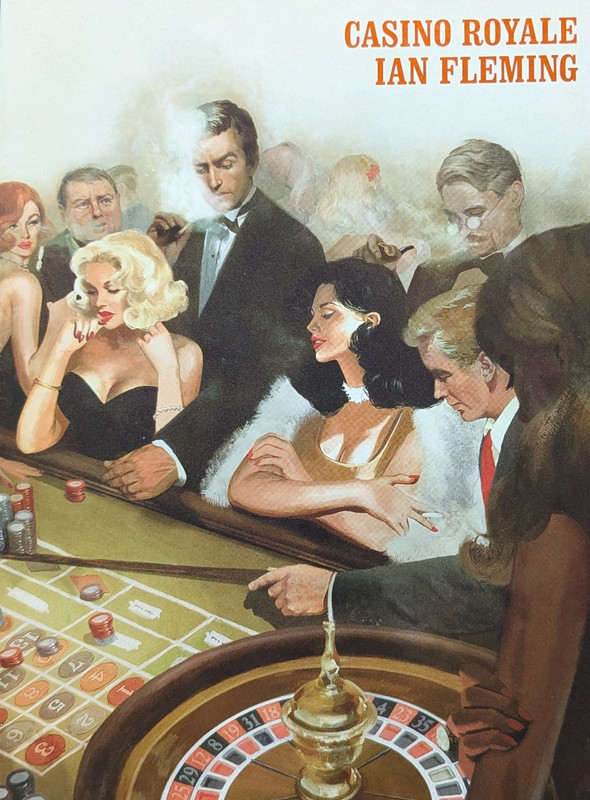
So, starting with the first Folio in the current series, published in 2015, Casino Royale.
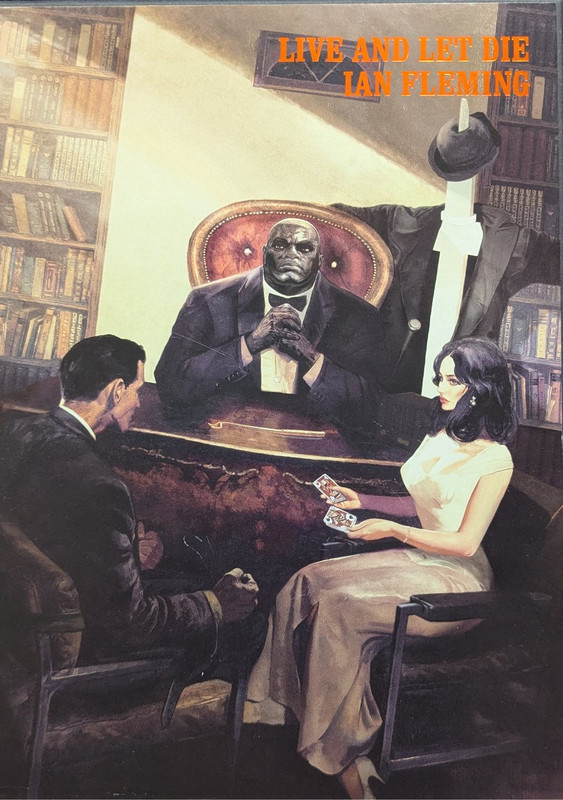
Live and Let Die was published in 2019.
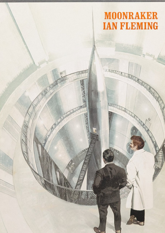
Bond and Drax, on the slipcase cover of 2017's Moonraker.
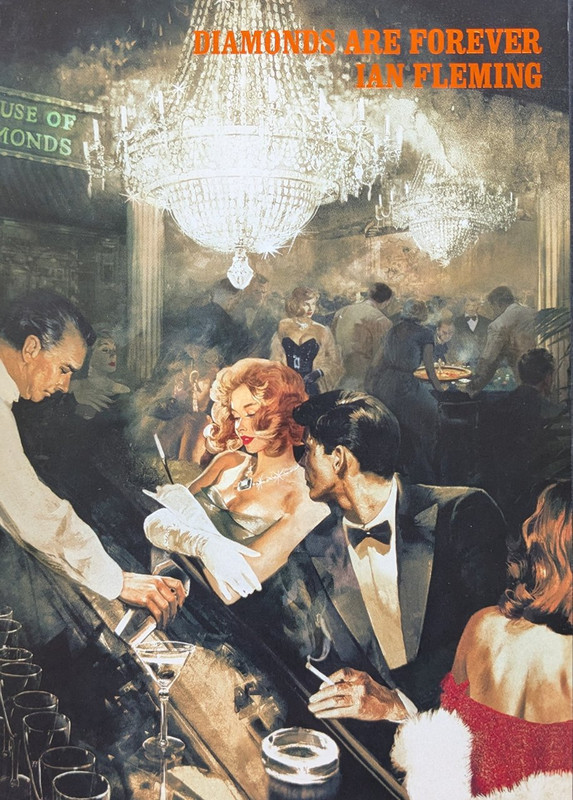
2018's Diamonds.
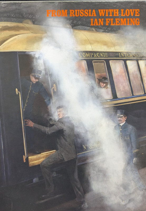
From Russia With Love was one of the earlier ones, 2016.
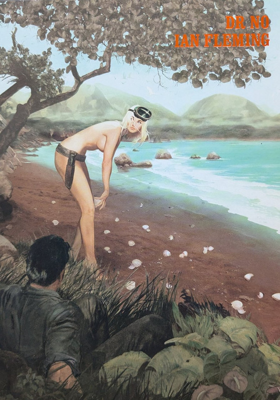
2017's Dr No.
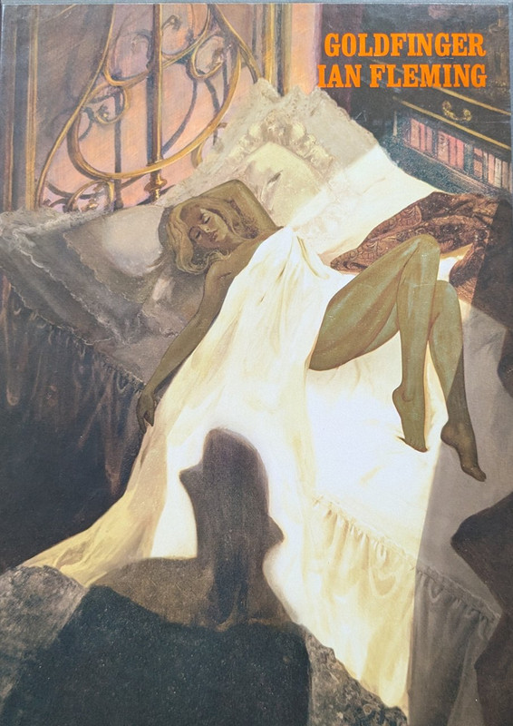
Goldfinger, (2018), had a gold-leaf type effect for Jill Masterson. I expect this'll rate high in the poll.
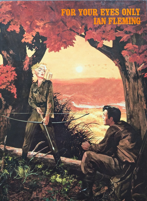
Eyes Only was the last Folio before the hiatus, coming out in 2022.
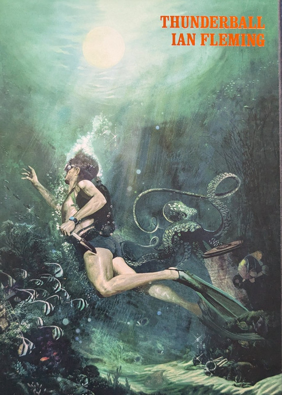
Thunderball came out in 2019.
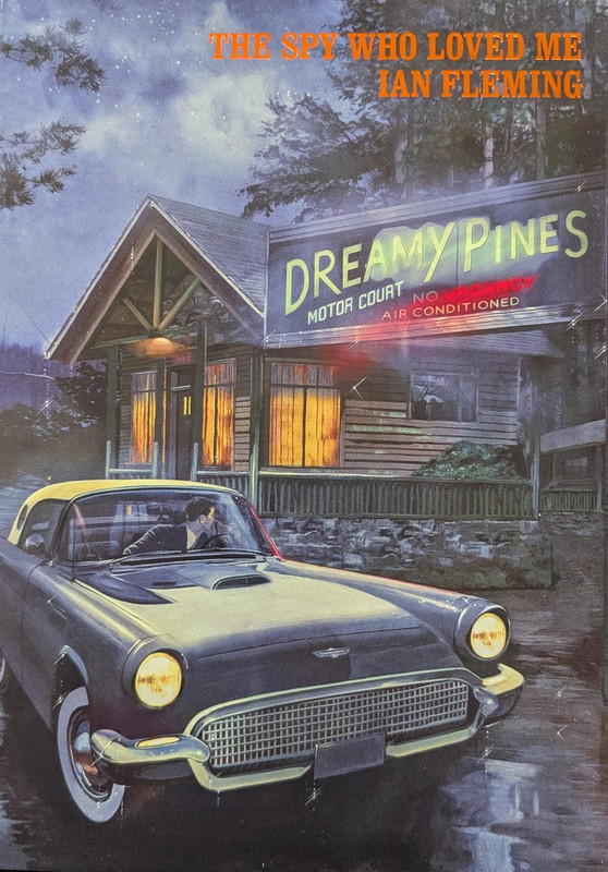
Spy, 2020.
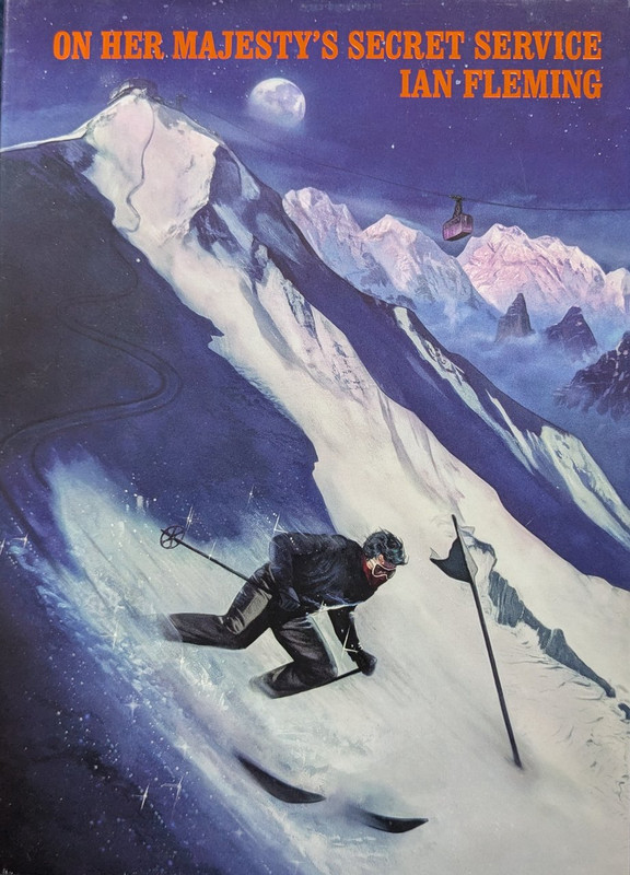
The middle book of the Blofeld Trilogy, from 2020.
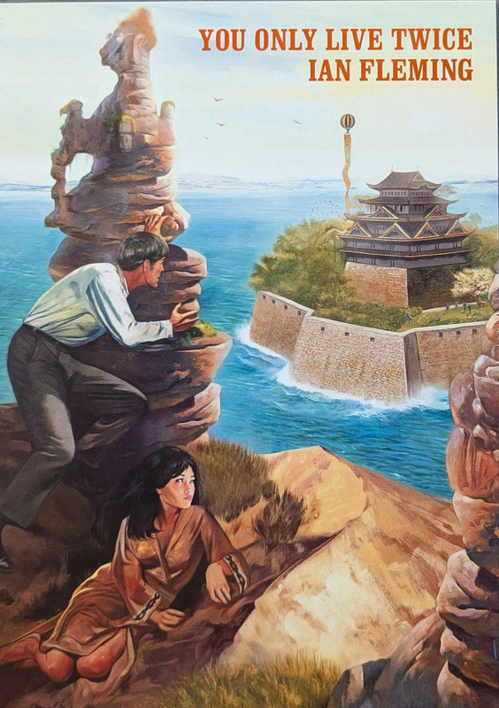
Bond and Kissy survey Blofeld's lair, from 2021.
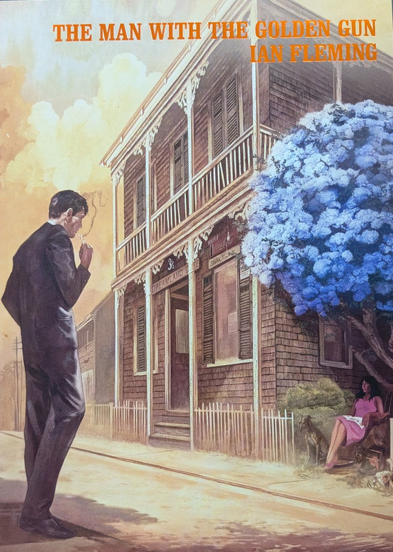
And Golden Gun was another more recent entry, from 2021.
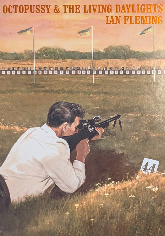
And finally, September 2025's lovely Octopussy and the Living Daylights.
I've taken photos of my covers rather than get the artwork off the Folio website, as they'll be higher resolution. Anyone can have a go at this of course, not just the Folio collectors on here.
So, starting with the first Folio in the current series, published in 2015, Casino Royale.
Live and Let Die was published in 2019.
Bond and Drax, on the slipcase cover of 2017's Moonraker.
2018's Diamonds.
From Russia With Love was one of the earlier ones, 2016.
2017's Dr No.
Goldfinger, (2018), had a gold-leaf type effect for Jill Masterson. I expect this'll rate high in the poll.
Eyes Only was the last Folio before the hiatus, coming out in 2022.
Thunderball came out in 2019.
Spy, 2020.
The middle book of the Blofeld Trilogy, from 2020.
Bond and Kissy survey Blofeld's lair, from 2021.
And Golden Gun was another more recent entry, from 2021.
And finally, September 2025's lovely Octopussy and the Living Daylights.
^ Back to Top
The MI6 Community is unofficial and in no way associated or linked with EON Productions, MGM, Sony Pictures, Activision or Ian Fleming Publications. Any views expressed on this website are of the individual members and do not necessarily reflect those of the Community owners. Any video or images displayed in topics on MI6 Community are embedded by users from third party sites and as such MI6 Community and its owners take no responsibility for this material.
James Bond News • James Bond Articles • James Bond Magazine
Comments
2. Thunderball
3. Diamonds are Forever
1. The Spy Who Loved Me
2. For Your Eyes Only
3. On Her Majesty’s Secret Service
4. Dr. No
5. You Only Live Twice
6. Thunderball
7. Casino Royale
8. Diamonds Are Forever
9. Octopussy & The Living Daylights
10. Goldfinger
11. Live and Let Die
12. Moonraker
13. From Russia with Love
14. The Man with the Golden Gun
2 Goldfinger
3 Thunderball
2 TSWLM
3 MR
DN
DAF
I like them all, and even the ones that don't work as well for me as others, (From Russia With Love, for example), still convey the mood of the book excellently.
Dr No seems popular, yet that's one of the less successful ones for me.
One random thought about the Goldfinger cover. In the book, Jill's death is described by Tilly in chapter 14, it's not actually described as far as I remember. The slipcase cover image of Jill in bed with Oddjob's shadow is really construct from the film, isn't it? I think this is one of the few times a Folio illustration borrows from the movie. Another example might be the illustration of Piz Gloria at the beginning of the OHMSS Folio, which is pictured as the actual building used in the film, rather than the description in the book of 'a group of buildings'.
I could be wrong on this.
Anyway, I've really enjoyed seeing people's favourite choices so far.
I have to say the Fleming nerd in me was very slightly disappointed to see the actual Piz Gloria used in the book, but that's just me being daft. And it's also a tribute to the attention to detail in the other novel-inspired pictures. For instance, if you check out Solitaire's cards on the LALD cover, they're playing cards (as in the book), and not tarot cards (as in the movie). And the cards are even correct if you look closely; the Knave of Hearts, and the Queen of Spades.
You've got to respect that kind of accuracy!
2 OHMSS
3 YOLT
The ocean, the Alps and a castle. All beautiful in their own right.
TB and OHMSS are also way up there for me.
The Blofeld Trilogy definitely did get some of the best covers!
FYEO, TMWTGG, and TSWLM are all strong honorable mentions, as well. Not really any duds in the bunch.
EDIT: That said I still like them, just think they could have been amazing.
I love it, of course. And the double-panel illustration on page 39 is a nice touch, (included I think, to soften the blow of it being quite light on illustrations, having only 4 illustrations over118 pages).
The slipcase cover is attractive, without being a top-tier entry for me.
I'm also going to agree with Nick that FRWL really deserves a better slipcase cover, being one of the best books (rated #2 on my most recent re-read). Though there's no illustration inside, that I'd prefer on the cover, to be honest.
Maybe I’d pick out TB and DAF as the better ones, but I don’t really like any others.
Agreed on OP/TLD; it’s very dull. The illustration style and flatness puts me more in mind of foreign language textbooks I used to have at school.
2. Thunderball: Great capture of the underwater world and has a nice exotic feel to it
3. The Man With the Golden Gun: Has a Western style to it and Bond looks really cool
4. OHMSS: Feels tense with the darkness it has; however it needs villains to make it more chase-like
5. TSWLM: Doesn't really communicate much but generally beautiful
6. LALD: Simple, and while not the most interesting scene (the keel-hauling scene probably could have made a better cover), the characters all look nice and the dynamic of the scene is captured well.
7. Dr. No: Honey doesn't look like how I think she would, and the scene isn't titillating at all, but it capture the moment quite well
8. Casino Royale: Doesn't adapt a scene from the novel but it does capture the casino atmosphere well
9. DAF: A bit similar to Casino Royale, I don't think Bond looks great either. Diamonds should have played a more prominent role.
10. FYEO: Not much to look at. Bond looks very Connery-like as well, which I am not a fan of
11. FRWL: Not much to look at, lacks some of drama and it needs another character on it for me personally
12. YOLT: Far too sunny and bright for the novel on the inside
13. OP&TLD: Again not much to look at. The scenery is also duller than its predecessors
14. MR: Doesn't really capture the enormity of the missile and Bond ends up looking small.
Interesting how Bond looks differently across covers. In Casino Royale he looks a bit like Peter Sellers in CR' 67, in LALD the face has a sharper profile and darker hair, in Moonraker a bit of a rounder head, Diamonds with a more square-ish face (but still different to LALD), FYEO with the more Connery-esque look etc.
I think I like the TMWTGG, FRWL and OP likeness the most though. Reminds me of that Midjourney AI creation of Fleming's Bond and is a bit more rugged Hoagy Carmichael.
The Bond girls are also interesting to see. I don't know if the brunette on the CR cover is supposed to be Vesper but it's an interesting and fresh look that works for me. Solitaire looks nice and is faithful to her description. I very much doubt that the girl next to Bond Bond at the bar in Diamonds is supposed to be Tiffany, but if so she doesn't look anything like how I'd expect (even excluding the hair). The three blondes have hair more blonde than I'd expect (Honey particularly looks like she'd had it dyed) but Jill pulls it off due to the slightly gold sheen of her skin, and then Kissy looks quite good and unique to the films or any other media.
I wonder if the artwork ever influences the reader's 'mind's eye' when they read the books? I don't think they do with me. It's a bit like when people say "what Bond actor do you picture when you read the books". I've never pictured an actor when I read Fleming, his Bond is different. I approach these Folio illustrations as another person's imagination. A person with a lot more talent than me, for putting things down on paper.
2. For Your Eyes Only - I just love the colours on this one
3. Diamonds Are Forever - Atmospheric in a way I find few of the others match, as good as they all are