Reporting For Duty
It looks like you're new here. If you want to get involved, click one of these buttons!
Quick Links
Categories
Andmcit - film poster mock ups

I've posted some of these in the main fan posters thread already but there's 100's of posts and comments there so here's a spot to keep them together as a matching set separately instead which will also allow me to add a few comments and thoughts about them to share with fellow Bondart fans.
They're just a hobby of mine and a purely creative outlet from my normal job where I can work up ideas purely for a relaxation basis. They keep me busy when I'm idly online on my mac and not reading threads here. Keeps me off ebay too...
The key idea for these is really just to indulge in photoshopping a modern take on the original posters which were in many cases purely illustrative so creating something different and maybe what could have been had there been DTP/photo manipulation in the 60's onwards. I'm not aiming to get too arty and abstract but grounding them in the real world with the expectations this brings. I do have some more left field ideas but want to develop a set of more 'normal' poster ideas first!
Where I can, I want to try and maintain the key fingerprint elements of the originals such as the logostyle title IF it still translates well (such as TSWLM) as well as period narrative copy and actual photo stills from the film in question or relevant onset pictures/promos particular to that film rather than a depiction of the lead actors from many other subsequent films etc. Keep the theme period and timeline honest!
In some cases I've fought the decision on how far to include elements from the films to capture the story or to have a cleaner more dramatic poster - it's a trade off that sometimes see's a favourite chosen depending on the mood as much as anything else! So. A few posters will have a couple of options/alternatives...
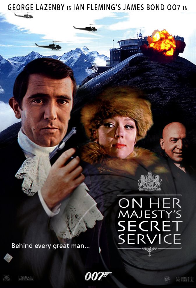
Anyway, my first is On Her Majesty's Secret Service which I've really wanted to have a go with for literally years and I like the results a lot. It helps too that I do believe I'm still hopelessly infatuated by for me, the best BEST Bond girl of them all. Had the Dianna Rigg of 1969 been here and now, I'm not sure whether I'd be the subject of a restraining order! lol
I feel this poster is a bit static due to most period pictures being b&w or poor quality so may strive to do a take 2:
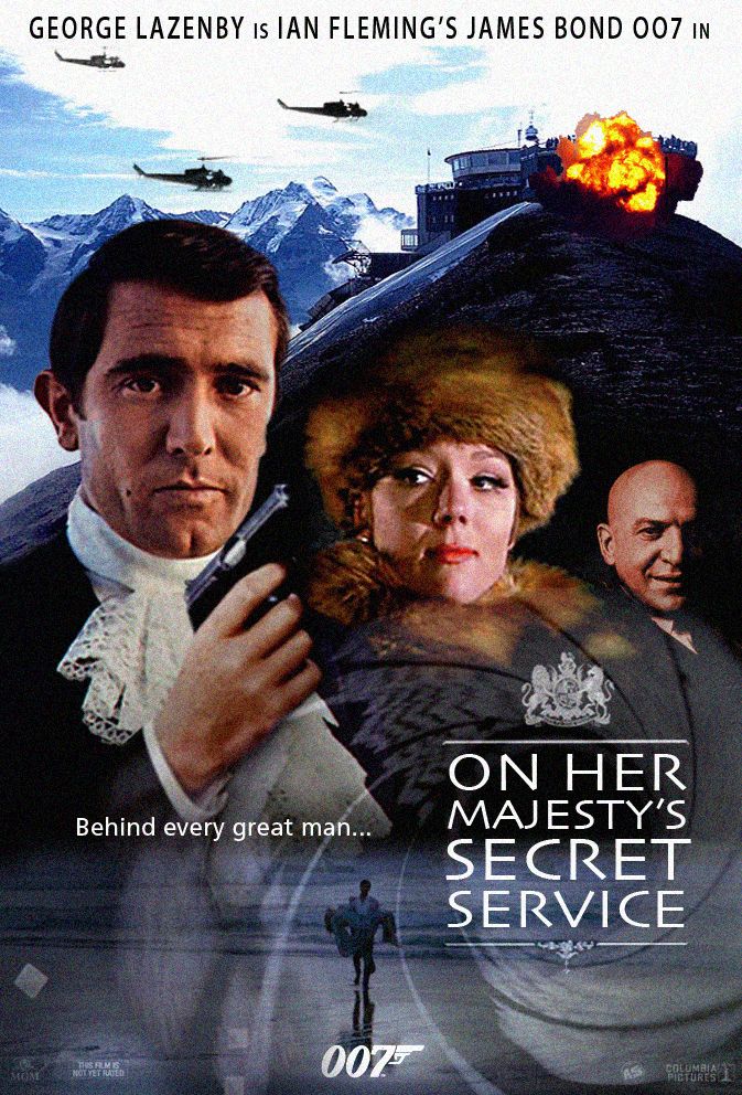
A second iteration to help lessen the dark tone of the overall effect and show the first symbolic meeting of Bond & Tracy:
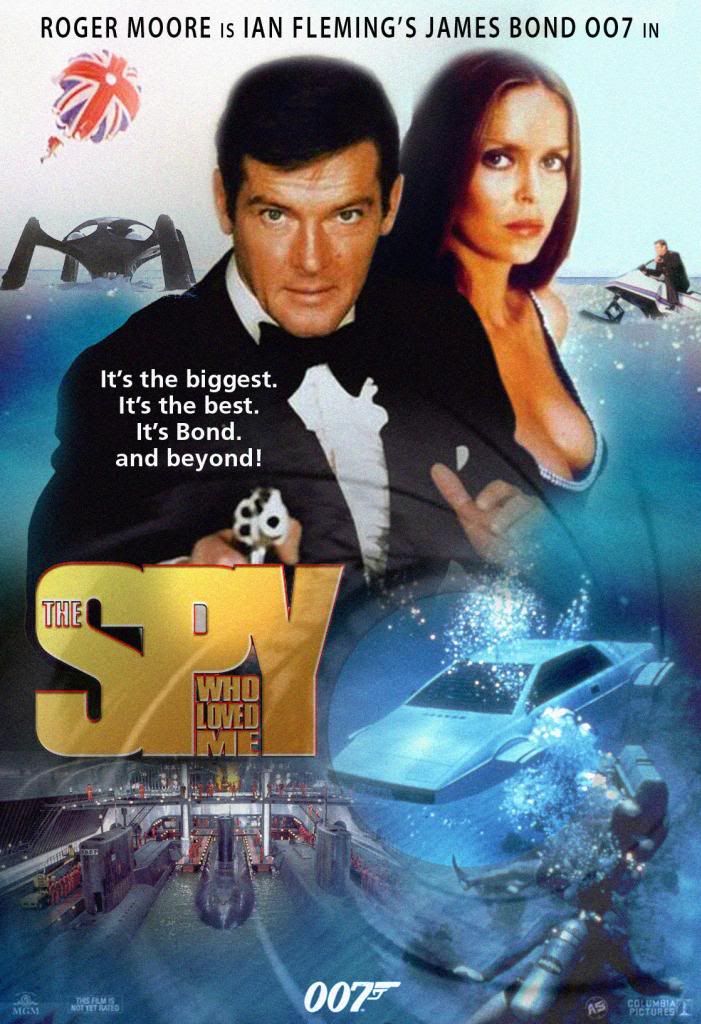
My next is The Spy Who Loved Me which is an original poster I have always loved and wanted to emulate by using photos - plus shorten RM's legs a bit too as in the original he must've been 7 odd foot tall!
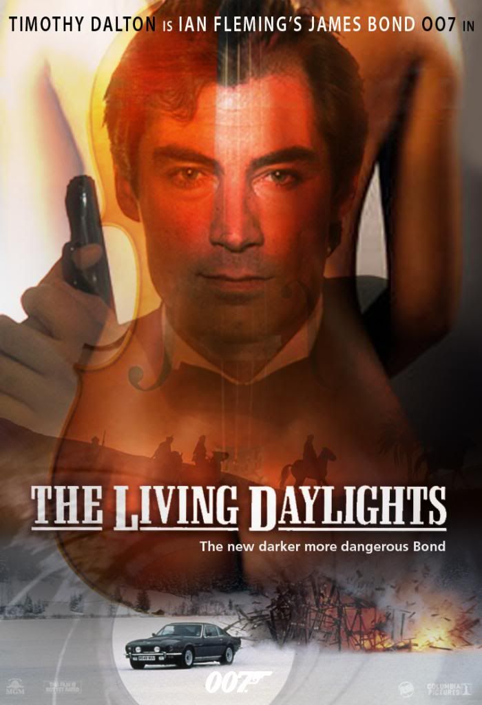
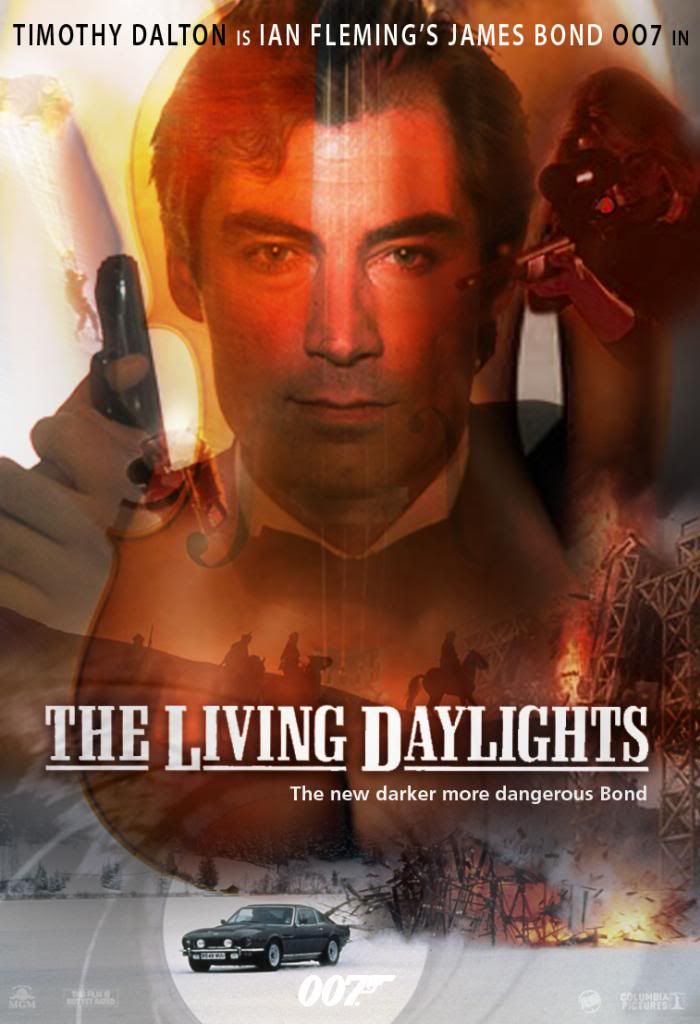
My next, The Living Daylights, is one of my favourite Bond films and where I have a genuine cinema front of house quad poster - to my horror now, as a silly student where I had it filling my wall I posted smaller posters with bluetac over the top of it in the black areas and this has slightly stained it! It certainly looks a bit too previously enjoyed but hasn't lost the rich colours and intensity which I lean towards emulating where I can.
A slightly busier alternative showing the sniper is a woman, that LandRover stunt at Gibraltar and the climax bridge explosion:
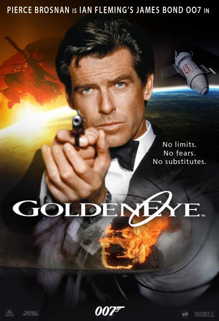
Goldeneye, another favourite of mine and a film that really had a positive impact for me!
A busier more action packed alternative:
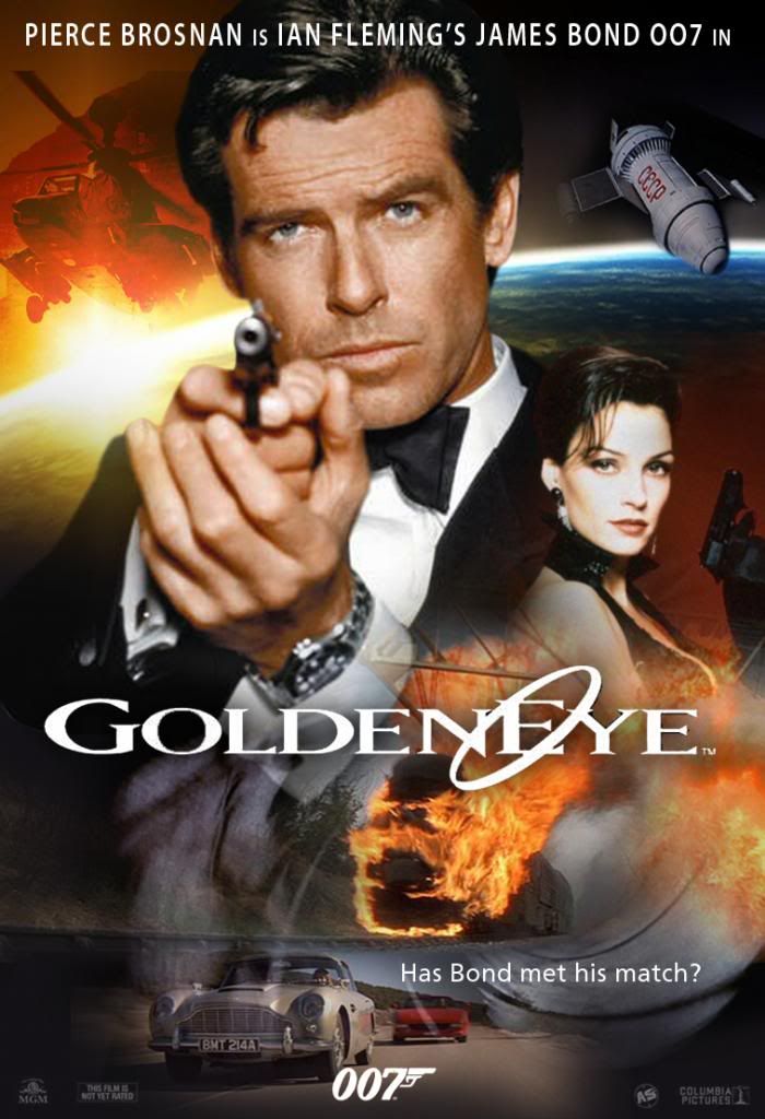
I was tempted to feature Natalya yet the more in your face character of Xenia Onatopp featured a better headline grabbing role than the smoulderingly demure 'thinking man's Bond girl' of Izabella!
Next the many twists in capturing Goldfinger - one of the biggies for me in terms of redesigning one of the big Bonds that always seems to top every list anywhere when Bond is mentioned. No pressure then!
Andrew
They're just a hobby of mine and a purely creative outlet from my normal job where I can work up ideas purely for a relaxation basis. They keep me busy when I'm idly online on my mac and not reading threads here. Keeps me off ebay too...
The key idea for these is really just to indulge in photoshopping a modern take on the original posters which were in many cases purely illustrative so creating something different and maybe what could have been had there been DTP/photo manipulation in the 60's onwards. I'm not aiming to get too arty and abstract but grounding them in the real world with the expectations this brings. I do have some more left field ideas but want to develop a set of more 'normal' poster ideas first!
Where I can, I want to try and maintain the key fingerprint elements of the originals such as the logostyle title IF it still translates well (such as TSWLM) as well as period narrative copy and actual photo stills from the film in question or relevant onset pictures/promos particular to that film rather than a depiction of the lead actors from many other subsequent films etc. Keep the theme period and timeline honest!
In some cases I've fought the decision on how far to include elements from the films to capture the story or to have a cleaner more dramatic poster - it's a trade off that sometimes see's a favourite chosen depending on the mood as much as anything else! So. A few posters will have a couple of options/alternatives...
Anyway, my first is On Her Majesty's Secret Service which I've really wanted to have a go with for literally years and I like the results a lot. It helps too that I do believe I'm still hopelessly infatuated by for me, the best BEST Bond girl of them all. Had the Dianna Rigg of 1969 been here and now, I'm not sure whether I'd be the subject of a restraining order! lol
I feel this poster is a bit static due to most period pictures being b&w or poor quality so may strive to do a take 2:

A second iteration to help lessen the dark tone of the overall effect and show the first symbolic meeting of Bond & Tracy:

My next is The Spy Who Loved Me which is an original poster I have always loved and wanted to emulate by using photos - plus shorten RM's legs a bit too as in the original he must've been 7 odd foot tall!

My next, The Living Daylights, is one of my favourite Bond films and where I have a genuine cinema front of house quad poster - to my horror now, as a silly student where I had it filling my wall I posted smaller posters with bluetac over the top of it in the black areas and this has slightly stained it! It certainly looks a bit too previously enjoyed but hasn't lost the rich colours and intensity which I lean towards emulating where I can.

A slightly busier alternative showing the sniper is a woman, that LandRover stunt at Gibraltar and the climax bridge explosion:

Goldeneye, another favourite of mine and a film that really had a positive impact for me!

A busier more action packed alternative:

I was tempted to feature Natalya yet the more in your face character of Xenia Onatopp featured a better headline grabbing role than the smoulderingly demure 'thinking man's Bond girl' of Izabella!
Next the many twists in capturing Goldfinger - one of the biggies for me in terms of redesigning one of the big Bonds that always seems to top every list anywhere when Bond is mentioned. No pressure then!
Andrew
^ Back to Top
The MI6 Community is unofficial and in no way associated or linked with EON Productions, MGM, Sony Pictures, Activision or Ian Fleming Publications. Any views expressed on this website are of the individual members and do not necessarily reflect those of the Community owners. Any video or images displayed in topics on MI6 Community are embedded by users from third party sites and as such MI6 Community and its owners take no responsibility for this material.
James Bond News • James Bond Articles • James Bond Magazine
Comments
My first stab is still OK really and I like it yet the stark white contrast of PG in the top right pulls the balance a bit so I tried a few alternative HB images plus introduced the Aston DB5:
Another variant trying an alternative take on the DB5 - it takes up too much emphasis so distorts the balance but an interesting variation - I especially like Oddjob in the darkness:
A simplified version next where i tried to link a few of the elements together more suggesting PG is in the background behind SC:
Another take to contrast the Bond (and car) versus Goldfinger/Pussy where the elements feel part of the WW2 nazi gold bar
After a rethink I tried a simpler version with a full overhaul of the various elements which I feel is probably the most dramatic being simplest too but tells little about then film:
FINALLY! A totally different image of SC trying elements I liked the best out of the previous versions see's this as the final (for now!) version:
Next I'm looking at doing something with The Man with the Golden Gun. Time will tell how I get on...
I really appreciate seeing that you guys like what I've been doing, as after all, you're the ones these posters would mean the most to more than anyone else!
It's a shame really that most of the source material for them is low quality/small file size from the web so limiting the size anything could be printed out for a real poster rather than just live here as one's and zero's!
I want to have a crack at Thunderball next...
Nice work all of it! I like your sense of colour.
Dalton's hairline with the lock reminds me strangely of Alain Delon. Did you insert that lock, @andmcit?
It doesn't look very TD but that's undoctored/as I found it:
I have previously found dozens upon dozens of high-resolution photos for a wide majority of the Bond films, so If you are ever in the need of any pictures don't be afraid to ask.
Take his assistance if you need it, this man is a genius at finding quality, high-res photos/unique, rarely seen pictures on the Internet. So far, though, so good! The posters look great.
By trade I guess I have a natural advantage and understanding with layouts and artwork as I am an artist / traditional hand drawn illustrator and graphics guy though the work is heavily biased to technically oriented industrial stuff.
I'm really still learning to create more complex artwork images in photoshop and never see anything like these posters though it's something I'd love to do all the time! I actually trained and worked in automotive / product design!
I agree. It isn't hard to imagine why all the ladies went after him.
Agree. Much prefer the first version.
@andmcit. Could you try one with a different photo of Lazenby by any chance? Not sure if I like how he looks there.
I agree GL does look odd because the file I used was a bit soft where the first version posted was sharpened. His expression looks a bit pensive. I love the Piz Gloria shot as it's so dark and broody and hadn't tried situating at the bottom before but the thought struck me as i was setting TMWTGG.
Most great period images I've been finding are black and white though I do fancy trying a monotone version sometime.
Bond on a poster without a gun? I actually totally agree it looked odd adding the gun where he's so close to such an 'intense' Tracy and prefer the original too!
Anyhow, how about:
I don't mind trying a rejig here as I like the excuse to stare all night at that picture of Contessa Teresa!
And for those that prefer a simpler version with fewer elements:
OK, there's one less and UA has covered herself up a bit!
I can have fun with these for hours!
Odd slant on things but sure:
Had the go with a slightly shallower UA portrait pic to reposition the title!